Located in the heart of the Great Lakes region, Waterwell is a consultancy firm dedicated to responsible water management. With a mission rooted in collective stewardship, Waterwell aims to lead the conversation in water sustainability. From partnering with government bodies and utilities to advising non-government organizations and local communities, the company endeavours to make a lasting impact on how we view and use one of our most precious resources — water.
Thanks to some deeply insightful brand discovery and research by Nicolette Stosur-Bassett over at the fantastic Do It Better Design consultancy, we hit the ground running with this project, and were empowered to dive straight into the weeds.
A BRAND IDENTITY IN NEED OF REFRESHMENT
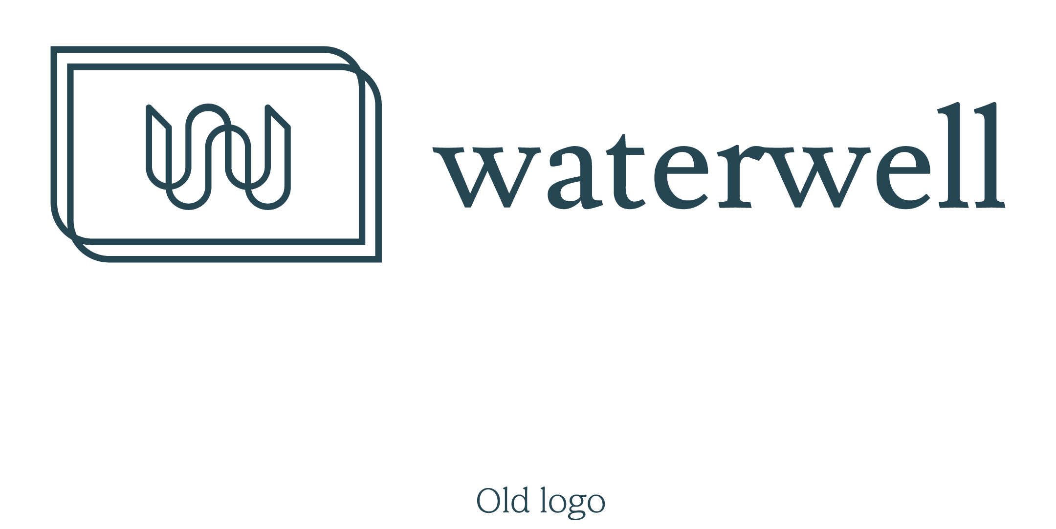
Waterwell’s original brand identity was dated, confusing, and layered with unnecessary complexities. It failed to clearly convey the company’s dedication to water stewardship and its accessible yet expert stance on the subject. The outdated look and feel were misaligned with the brand’s vision, diluting its message and complicating its engagement with both primary and secondary target audiences.
A DEEP-DIVE INTO BRAND RESURGENCE
With the brand’s strategic proposition — “Stewarding the future of water together” — as our guiding light, we began the redesign process.
Visual Monogram
Central to the new identity was a reimagined wordmark that integrated a visual monogram within it. The new “W” was crafted from ancient symbols representing “water” and “alliance”, encapsulating the essence of the brand’s mission. This monogram served as a constant visual reminder of Waterwell’s commitment to collective action.
Monogram
Wordmark
BRAND TYPOGRAPHY
Our gorgeous primary brand font, Gelica, is a soft serif that exudes a friendly and approachable vibe without veering into excessive cuteness. While its design influences can be traced back to Goudy Heavyface and Ludlow Black, Gelica offers its own unique charm. It boasts a weight range that works well for various applications, from display settings to smaller sizes for longer copy, accompanied by matching italics and useful OpenType features.
Gelica perfectly complements Waterwell's brand ethos. Its balance of friendliness and professionalism mirrors Waterwell's commitment to stewardship and community engagement. It is versatile enough to be used in various brand assets, ensuring that the brand message is cohesive, no matter the medium.
So, whether you're reading about Waterwell's latest sustainability project or looking at their brand merchandise, Gelica ties everything together, enhancing the overall brand experience and reinforcing Waterwell’s mission: "Stewarding the future of water together."
BATHYMETRIC ILLUSTRATIONS
One of the most technically challenging yet rewarding aspects of this project was creating a set of illustrations based on actual bathymetry diagrams of the Great Lakes. Given their intricate details and complexities, translating these diagrams into easy-to-use pieces was no small feat. However, this formed a compelling visual language that was both local and relevant to Waterwell’s operations.
THE FINAL IDENTITY
The new identity extends beyond the logo. The monogram and illustrations seamlessly flow into every piece of brand collateral, from stationery to brand merchandise. Each element serves to reinforce Waterwell’s commitment to shared responsibility and expertise in the field.
The end result is a brand identity that not only stands out but also stands for something meaningful. It encapsulates Waterwell’s vision and mission, making it easier for the brand to connect with its audience, foster partnerships, and most importantly, steward the future of water, together.
We’re proud to have partnered with Waterwell in this transformative journey. As we look forward to the brand making waves in the industry, we’re reminded that the best results are achieved when we come together for a cause as universal and vital as water.
CLIENT FEEDBACK
Needless to say, all of our hard work paid off, and the client loved the final result. Here’s what they had to say:
“Asking a designer to work with previously created design elements in order to help refresh a company brand is a delicate process. The TWO Design team brought a high-level of professionalism, creativity, and graciousness to the effort, and we are thrilled with the results! Their thoughtful and beautiful design work wonderfully honors Waterwell's mission.”


